# Chat Components
> A guide for creating Chat Components in a Minecraft datapack using Kore.
Updated 2026-10-07. Canonical: https://kore.ayfri.com/docs/concepts/chat-components
Chat Components are used to create rich text messages in Minecraft. They can include formatting, interactivity, and nested components. Kore
has functions to create and manipulate Chat Components in a datapack.
Note that they always work by groups named `ChatComponents`, whenever you create a chat component, you actually create a
`ChatComponents`, and you can chain multiple components together using the `+` operator.
Minecraft sometimes does not allow "complex" chat components with data resolving (`score`, `nbt` and
`entity` chat components), if you use them, you'll get an empty text component. Simple chat components are inheriting the
`SimpleComponent` interface, and you have a
`containsOnlySimpleComponents` property to check if a `ChatComponents` only contains simple components.
You also have a `containsOnlyText()` function to check if a
`ChatComponents` only contains plain text components with no formatting.
### Common Properties
- `bold` - Whether the text is bold.
- `clickEvent` - The action to perform when the text is clicked.
- `color` - The color of the text.
- `extra` - Additional components to display after this one (prefer using the `+` operator).
- `font` - The font to use.
- `hoverEvent` - The action to perform when the text is hovered over.
- `insertion` - The text to insert into the chat when the text is shift-clicked.
- `italic` - Whether the text is italic.
- `obfuscated` - Whether the text is obfuscated.
- `shadowColor` - The color of the shadow behind the text, written as an ARGB int (use `argb(...)` to control transparency).
- `strikethrough` - Whether the text is strikethrough.
- `text` - The text to display.
- `underlined` - Whether the text is underlined.
## PlainTextComponent
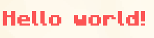
The `PlainTextComponent` displays simple text with optional formatting such as color and bold.
To create a `PlainTextComponent`, use the `textComponent` function.
### Example
```kotlin
val plainText = textComponent("Hello, world!") {
color = Color.RED
bold = true
}
```
In-game output:
See how to set custom colors in the [Colors](https://kore.ayfri.com/docs/concepts/colors.md) article.
A line break in the text (`"line 1\nline 2"`) is written as the `\n` escape in commands, since a raw one would split the
function line in two, and a backslash is written as `\\` so the game doesn't read it as an escape.
### Combined Components
Components can be combined using the `+` operator, use the `text` function to create a simple text component and not a
`ChatComponents`. `+` returns new `ChatComponents` and leaves both sides untouched, so a shared prefix can be reused
across messages.
```kotlin
val combinedComponents = textComponent("Hello, ") + text("world!") {
color = Color.RED
bold = true
}
```
In-game output:
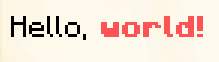
> (only the "world!" part is bold and red)
The game reads a list `[a, b]` as `a` with `b` among its children, so `b` inherits the style of `a`. When the first
component carries a style, Kore writes an empty root first, so each component keeps its own style:
```kotlin
textComponent("Gold ", Color.GOLD) + text("plain")
// [{type:"text",text:""},{type:"text",color:"gold",text:"Gold "},{type:"text",text:"plain"}]
```
Item lore is the exception: its list holds one line per element, so it's written as is.
## EntityComponent
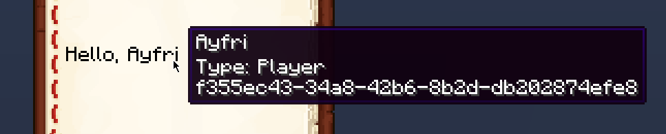
The `EntityComponent` displays the name of an entity selected by a selector. If multiple entities are found, their names are displayed in
the form `Name1, Name2` etc.
The `separator` property can be used to change the separator between the names of the entities.
If no entities are found, the component displays nothing.
### Example
```kotlin
val entityComponent = entityComponent(self())
```
In-game example:
## KeybindComponent
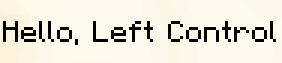
The `KeybindComponent` displays a keybind. The keybind is displayed in the player's keybind settings.
### Example
```kotlin
val keybindComponent = keybindComponent("key.sprint")
```
In-game example:
## NbtComponent
The `NbtComponent` displays NBT data from a block, an entity, or a storage. The
`interpret` property can be used to interpret the NBT data as a text component, if the parsing fails, nothing is displayed.
The `plain` property suppresses SNBT key/value coloring when set to `true`; it cannot be combined with `interpret`.
The `nbt` property can be used to specify the path to the NBT data.
If `nbt` points to an array, then it will display all the elements joined in the form `Element1, Element2` etc.
The `separator` property can be used to change the separator between the elements of the array.
If you need a refresher on how Kore builds NBT in general, see [NBTs](https://kore.ayfri.com/docs/concepts/nbts.md) for the shared builder DSL,
common helpers, and other contexts that use the same patterns.
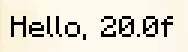
### Example
```kotlin
val nbtComponent = nbtComponent("Health", entity = nearestEntity {
type = EntityTypes.CREEPER
})
```
You can also point it at block positions or storages depending on the source you want to read from.
In-game output:
## ScoreComponent
The `ScoreComponent` displays the score of an entity for a specific objective. The
`name` property can be used to specify the name of the entity whose score to display, it can be a selector or a literal name (will use the
player with that name). It can also be `*` to select the entity seeing the text component.
The `objective` property can be used to specify the name of the objective to display the score of.
A `value` property can be used to specify a fixed value to display regardless of the score.
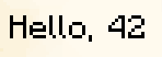
### Example
```kotlin
val scoreComponent = scoreComponent("test")
```
In-game output:
## TranslatedTextComponent
The
`TranslatedTextComponent` displays translated text using translation keys. You can also pass arguments to the translation key with the
`with` argument, which is a list of strings or a list of components - so the result of any component factory (
`scoreComponent`,
`entityComponent`, `textComponent`, etc) can be passed directly.
A `fallback` property can be used to specify a fallback text if the translation key is not found.
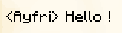
### Example
```kotlin
// Strings are wrapped as text components automatically.
val translatedFromStrings = translatedTextComponent("chat.type.text", listOf("Ayfri", "Hello !"))
// Or pass components directly, no need to unwrap them.
val translatedFromComponents = translatedTextComponent(
"chat.type.text", listOf(
textComponent("Ayfri", color = Color.AQUA),
scoreComponent("kills", self()),
)
)
```
In-game output:
## Hover Event
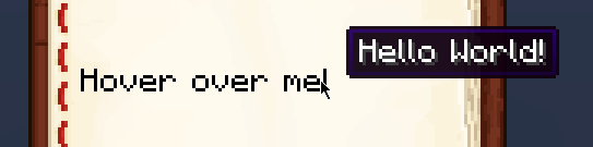
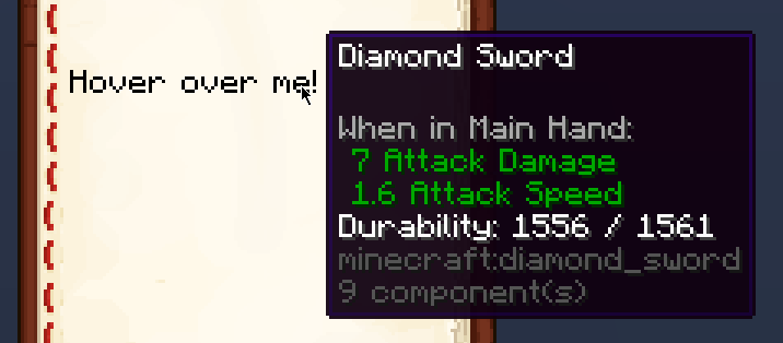
Hover events display extra information when the text is hovered over, it can be either text, an item, or an entity. Use
`showText` to display text, `showItem` to display an item, and `showEntity` to display an entity.
Note that to show an entity, you have to have its UUID as a string.
### Hover Event Example
```kotlin
val hoverEventComponent = textComponent("Hover over me!") {
hoverEvent {
showText("Hello, world!")
}
}
```
In-game output:
### Hover Item Example
```kotlin
val hoverItemComponent = textComponent("Hover over me!") {
hoverEvent {
showItem(Items.DIAMOND_SWORD {
damage(5)
})
}
}
```
In-game output:
## Click Event
Click events perform an action when the text is clicked. The action can be to:
- Change the page of the book if reading a book
- Copy some text to the clipboard
- Open a file
- Open a URL
- Run a command
- Suggest a command (insert the command in the chat but don't run it)
### Click Event Example
```kotlin
val clickEventComponent = textComponent("Click me!") {
clickEvent {
runCommand {
say("Hello, world!")
}
}
}
```
The `runCommand { }` and `suggestCommand { }` builders have no datapack in scope, so a function call inside them needs
the function itself or a namespaced id. A bare name like `function("join")` throws because its namespace can't be
resolved:
```kotlin
val join = function("join") { say("Joined!") }
val joinButton = textComponent("[Join]") {
clickEvent {
runCommand { function(join) } // or function("my_pack:join")
}
}
```
## Object Components
Object components render atlas sprites or player skins inside chat. They require the
`ObjectTextComponent` family and can be built via
`objectComponent` or `playerObjectComponent` depending on the source.
All object components share a `fallback` property: a `ChatComponents` value used when the object cannot be displayed
(for example, when printing messages in server logs or during narration). Pass it directly to the factory or set it in the builder block.
### AtlasObjectTextComponent
- `atlas` - The atlas that contains the sprite. Optional when the sprite already resolves to an atlas entry, otherwise provide an explicit
`AtlasArgument`.
- `fallback` - Text component used when the sprite cannot be displayed (e.g. in server logs or during narration).
- `sprite` - The `ModelArgument` that identifies the sprite to render and is required.
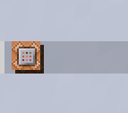
Use `objectComponent` to construct atlas objects, optionally passing an atlas override and a fallback.
```kotlin
val atlasObject = objectComponent(
sprite = Textures.Block.COMMAND_BLOCK_BACK,
atlas = Atlases.BLOCKS
)
val atlasObjectWithFallback = objectComponent(
sprite = Textures.Block.COMMAND_BLOCK_BACK,
fallback = textComponent("command block")
)
```
In-game output:
### PlayerObjectTextComponent
- `fallback` - Text component used when the player model cannot be displayed (e.g. in server logs or during narration).
- `hat` - Whether to display the player's hat layer (true/false) or leave it untouched when null.
- `player` - A `PlayerProfile` describing the skin whose head should render; provide either a name, UUID, or both plus properties.
`playerObjectComponent` accepts a `PlayerProfile`, name, or `UUIDArgument`, and the nested `player` block lets you add
`PlayerProperty`
estimations.
```kotlin
val playerObject = playerObjectComponent("ayfri") {
player {
property("textures", "base64_encoded_texture_data")
}
}
val playerObjectWithFallback = playerObjectComponent(
playerName = "ayfri",
fallback = textComponent("ayfri's head")
)
```
In-game output:
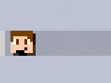
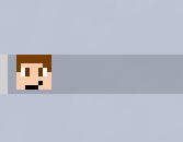
Notice that there is a shadow on the player's head, you can disable it by setting `shadowColor` to 0.
```kotlin
val playerObject = playerObjectComponent("ayfri") {
shadowColor = argb(0, 0, 0, 0)
}
```
In-game output:
These components respect the same formatting as any other chat component, so you can still chain them, color them, or attach hover and click
behaviors.
## Parsing existing components
Chat components round-trip: besides building them in Kotlin, you can decode vanilla JSON (or SNBT) back into
`ChatComponents` using `ChatComponents.serializer()`. Every component type is supported (text, translatable, score,
selector, keybind, nbt, object), along with nested `extra`, styling, and hover/click events. A bare string, a single
object, and an array of components are all accepted.
```kotlin
val component = Json.decodeFromString(
ChatComponents.serializer(),
"""{"type": "text", "text": "Hello", "color": "red"}""",
)
```
This is what the [datapack importer](https://kore.ayfri.com/docs/advanced/bindings.md) uses to read components (such as a `pack.mcmeta`
description) from existing packs.